Vertical rhythm on DOM elements with dynamic heights – Keep the Rhythm
That is a lot in one sentence, but basically it explains it all. Maintaining a vertical rhythm is hard enough by itself and takes a lot of time and thinking to accomplish.
The problem with maintaining a proper rhythm are objects (like images) that have dynamic heights. Like the images on this blog, or when you have clients uploading their content which isn’t perfectly resized / cropped to your line-height.
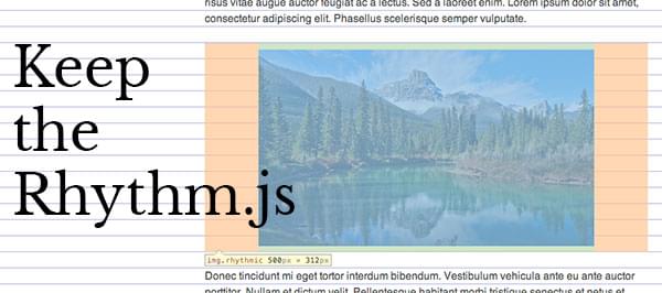
For this I created a jQuery plugin that fixes the rhythm: Keep the Rhythm.
Rhythms are sexy and make the web a better place. It makes it way easier to read the page and it will look very balanced at the same time. It might be a bit of extra work to create a vertical rhythm, but it’s really worth the time.
What is a vertical rhythm?
Vertical rhythms make sure the text and elements on your page are aligned to a baseline rhythm. Look at it as if you had a notebook with line, these are the guides we write on.
You can get the concept of vertical alignment pretty quick when you take a look at the example.
How can I create a vertical rhythm?
There are tons of website where you can generate your vertical rhythm CSS so it does all the calculation for you. What I like to use is Compass’ vertical rhythm mixins. Still not using Compass? This might be a great opportunity to. Vertical rhythms are a breeze when you use Compass.
What does Keep the Rhythm do?
Maintaining a vertical rhythm using line-heights is pretty doable, but there are also inline and block elements that don’t have their heights set to a rhythm. Of course the most pesky ones in this case are images.
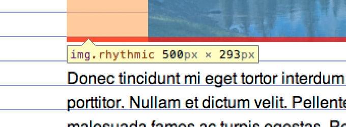
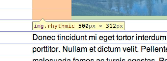
Imagine you have a baseline of 24 pixels and the image is 50 pixels tall, this means your image is 2 pixel too tall, or 22 pixels too short. Keep the Rhythm will fill this gap for you with paddings (or margins) so the elements has a perfect rhythmic height.
It fixes this:
 Incorrect Rhythm, overlap marked in red.
To this:

It does not only fix images, it also fixes block elements like iframes. Which will come in handy when embedding media from Youtube or Vimeo.
Responsive.
This script fixes the vertical alignment of elements that get resized because of a responsive layout too. This will work on very object that changes size on the window’s resize() event.
How to use?
First thing you want to do is to include jQuery and Keep the Rhythm in your webpage. Place the following code in your tag or before the end of your.
<script type="text/javascript" src="path/to/js/jquery-1.9.1.min.js"></script>
<script type="text/javascript" src="path/to/js/jquery.keeptherhythm.js"></script>
Then, on $(document).ready(); or $(window).load(); call the function using a selector. Define the baseline in the options.
$(document).ready(function () {
    $("div.rhythm").keepTheRhythm({
        baseLine: 20
    });
});

$(window).load(function () {
    $("article img").keepTheRhythm({
        baseLine: 20
    });
});
That’s basically it! The padding will now be added automatically.
Use window.load event for images
Because images get their height and width set after they have been loaded it’s best if you use the .load() event of the window. It’s best to always perform the rhythm fixes after this event so you can be sure that the images have their heights set.
I want to use margin instead of padding
Well, you can. Just pass an extra option value to the function call:
$("element").keepTheRhythm({
    spacing: "margin"
});
The element shouldn’t be aligned to the center
There is also an option for that, it can be “top”, “center” or “bottom”:
$("element").keepTheRhythm({
    verticalAlignment: "top"
});
Conclusion
Hopefully this little plugin will help you maintain a perfect rhythm and keeps your readers happy. Let me know what you think and contribute on GitHub if anything is wrong with the script.
Documentation reference
Keep the Rhythm Documentation
- keepTheRhythm(objectoptions);The main function to make the elements align to the vertical rhythm.
Options intbaseLineDefine the baseline height of your design in pixels. Default: 24. stringverticalAlignmentDetermine how the element should be aligned. Options: "top", "center", "bottom". Default: "center". stringspacingChoose between padding or margin spacing. Default: "padding".
