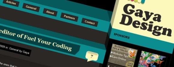
New design for Gaya Design
Yesterday I finally launched my new layout for the world to see! There are even new things to be done on the site now.
After about a month of hard work it’s done, ready to be shown in public.
I wanted to go for a retro, colourful and playful layout. With these things in mind I got working on an idea of the layout. I really like out of the box and semi 3D effects in web designs, looks different and so simple at the same time.
That’s why this layout looks like it does right now. After a few weeks of designing, coding the layout, designing again and coding again it was time to put the layout to the test. I got a lot of feedback from you guys and I am very thankful for that! You guys seriously rock!
A few things about the new design:
- Advertisement spots are now available.
- Chimneys on the roof that are smoking.
- Oh, try and pick the chimneys up!
- A few jQuery effects to give power to the design.
- Tabbed content in the sidebar to see my top reads.
- E-mail subscription on Feedburner.
- Some navigational and page changes.
Thanks to everyone on Twitter too! You guys are amazing and gave me a lot of feedback! Thanks again!
